Thanks are extended to John Bruni for information on this webpage.
Each successive image shows the gradual transformation from the bivariate normal distribution to a correlation line. The same area is shaded the same color in each image. Attend also to the names of the axes. The image gradually shifts to an overhead view and then collapses into the correlation.
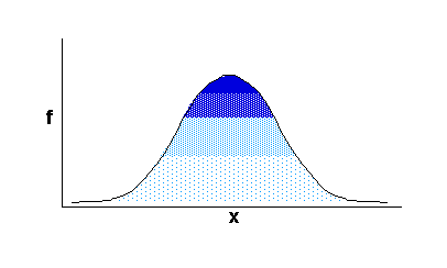
1. First is the typical view of the univariate normal distribution. Remember this is a plot of how frequently (f) each score appears in a set of scores from a measure (x), such as IQ scores. This is a frequency graph for a univariate distribution.
2. Study the image below carefully. Your view has moved so you are looking slightly down on the distribution. See that the y-axis appears. A second measure (y), such as ACT scores, has been introduced. This second measure has its own frequency distribution. It is also a bell-shaped (or normal) distribution.
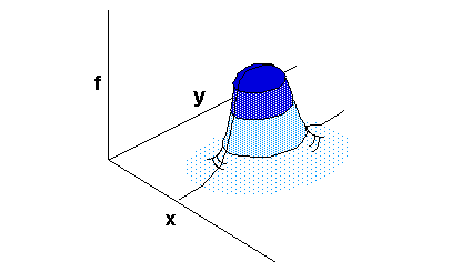
The first image and this image differ in that 2 variables (x and y, such as IQ and ACT scores) are involved. On this second image you see the distribution of 2 variables relative to each other. This is called a bivariate normal distribution.
How do we get from the above
image to the typical xy line graph of the correlation between two variables?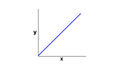 Proceed
to the next step to see....
Proceed
to the next step to see....
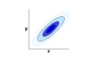
3. Now you are looking directly down on the bivariate normal distribution. The y-axis is dominant. This is a classic scatter-plot. There is no relationship (r = 0) between y and x so the plot appears circular.
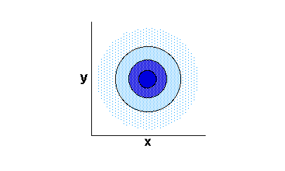
4. As the correlation between x and y is increased (by whatever means), the circles narrow of flatten. For example, as the correlation between our measures of IQ and ACT increase, a high score on the IQ test (x) is more and more likely to result in a high score on the ACT (y)
5. Until finally you see the straight line of the perfect (r =1.0) correlation. With a perfect correlation you know that a high score on the IQ test will result in the same level of high score on the ACT. (Of course this is just a theoretical example. The actual correlation between IQ and ACT is not perfect).
From the side (same direction as the first image) what would this one look like?
Contact the author with comments or questions about this site by following the directions at this page (which will open in a new window.)