![]()
Colors in animation
In animation, color is a vital tool for storytelling that conveys emotion, sets the mood, and defines characters and environments. Animators use color theory and psychology to deliberately craft a visual language that can communicate complex messages to the audience, sometimes without a single word.
- Color as a storytelling tool
- Evokes emotion:
- Warm colors like reds, oranges, and yellows can create feelings of energy, excitement, or passion.
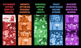
- Conversely, cool colors such as blues and greens often evoke calmness, tranquility, or sadness.
- For example, the warm, vibrant colors of the Pride Lands in Disney's <The Lion King> establish a sense of warmth, while the dark, sickly greens of Scar's territory signal danger.

- Warm colors like reds, oranges, and yellows can create feelings of energy, excitement, or passion.
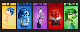
- Defines characters:
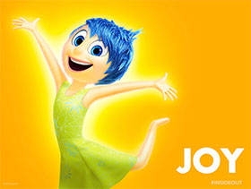
- Character color palettes often reflect their personalities and morality.
- Heroes may be given bright colors to symbolize virtuous characteristics. For instance, the character Joy in Pixar's <Inside Out> is yellow to reflect her cheerful personality.
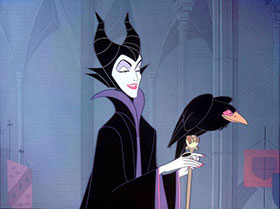
- Villains are frequently associated with dark, menacing colors like blacks and purples to symbolize their negative qualities. In <Sleeping Beauty>, the villain Maleficent is typically cloaked in purple and black.
- Character color palettes often reflect their personalities and morality.
- Establishes mood and tone:
- The overall color scheme, or palette, can define the mood of a scene or the entire film.
- Muted or desaturated palettes can convey a sense of melancholy or nostalgia, while vibrant, saturated colors can create a sense of joy or wonder.
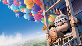
- In Pixar's <Up>, the palette shifts from vibrant and colorful during happy times to desaturated grays and browns during scenes of sadness and loneliness.

- The overall color scheme, or palette, can define the mood of a scene or the entire film.
- Guides the narrative:
- Animators can use color shifts to signify major narrative changes, character development, or transitions between different parts of the story.
- For example, as a character undergoes personal transformation, the color palette might shift from a calm, muted palette to a more vibrant one.
- Animators can use color shifts to signify major narrative changes, character development, or transitions between different parts of the story.
- Enhances world-building:
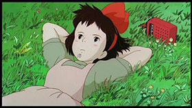
- In animation, colors help create a cohesive and believable world. In Studio Ghibli's <Spirited Away>, the mundane human world has a muted palette, which contrasts with the vibrant, rich colors of the magical spirit world.
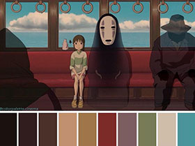
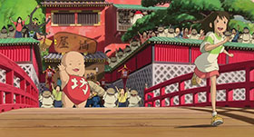
- In animation, colors help create a cohesive and believable world. In Studio Ghibli's <Spirited Away>, the mundane human world has a muted palette, which contrasts with the vibrant, rich colors of the magical spirit world.
- Evokes emotion:
- Key concepts of color theory in animation
Animators rely on fundamental color theory concepts to create their palettes and manipulate their visuals. These include:
- Color schemes: These are collections of colors, based on the color wheel, that work together to create a specific mood. Common schemes include:
- Complementary: Using colors opposite each other on the color wheel (e.g., blue and orange) to create high contrast and drama.
- Analogous: Using colors next to each other (e.g., red, orange, and yellow) for a harmonious, blended feel.

- Monochromatic: Using variations of a single color to create consistency and simplicity.
- Complementary: Using colors opposite each other on the color wheel (e.g., blue and orange) to create high contrast and drama.
- Hue, value, and saturation: Animators adjust these three attributes to achieve different effects.
- Hue is the pure color itself, such as red, blue, or green.
- Value (or brightness) is how light or dark a color is.
- Saturation is the intensity of a color. Fully saturated colors are vivid, while desaturated colors appear washed out and muted.
- Hue is the pure color itself, such as red, blue, or green.
- Color scripts:
- Many animation studios, such as Pixar, use color scripts—a series of small paintings or images—to map out the emotional arc and color palette of a film from beginning to end. This serves as a visual guide for the director to ensure emotional and visual consistency.
- Many animation studios, such as Pixar, use color scripts—a series of small paintings or images—to map out the emotional arc and color palette of a film from beginning to end. This serves as a visual guide for the director to ensure emotional and visual consistency.
- Color schemes: These are collections of colors, based on the color wheel, that work together to create a specific mood. Common schemes include:
- Cultural differences:
- The meaning of colors can vary significantly across cultures. For example, white can symbolize purity in some Western cultures but is the color of mourning in some Asian countries. A thorough understanding of the target audience's cultural context is critical when selecting color palettes.