Data is entered and manipulated in Excel within cells. When you view an Excel chart on the screen, each rectangle is a cell. Cells can contain letters, numbers or equations. Equations operate on other cells in the spreadsheet to calculate values. The cells are divided into columns, designated by letters, and rows, designated by numbers, and are denoted by the letter, followed by the number. For example, the first cell on a worksheet is A1 . You can enter data into cells in a number of ways. The easiest is simply by typing the desired value into the cell and pressing the Enter key, but this can become tedious if there is a list or series of data that you wish to enter. This can be done by pasting a series of data or entering an equation. You can also plot a graph of your data.
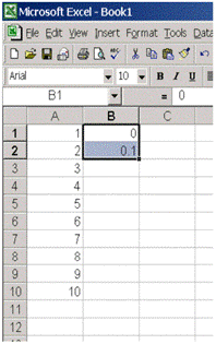
Pasting a series of data is useful if there is a regular pattern to the data, or if it is useful to view the form of an equation. It is of much use in analysis, but is a good introductory exercise as it illustrates some useful techniques. In this, we will see how to make three columns of regularly spaced data.
We will now see how to manipulate data using equations. This is useful when you want to test out a calibration curve, or use the calibration equation to analyze experimental data. You can use Excel to generate complex equations however we will only treat very simple ones here. Before we begin, note the table of operators below used in numerical computing. These are not exactly the same as you would see written elsewhere, but they mean the same thing.
Task |
Operator |
Example |
Result |
Multiplication |
* |
2*3 |
6 |
Division |
/ |
4/2 |
2 |
Exponent |
^ |
2^3 |
8 |
Order of Operations |
(..) |
2*3+5 or 2*(3+5) |
11 or 16 |
Power of ten |
e or E |
3.2e+2 or 3.2e-2 |
320 or 0.032 |
Continuing from the previous example:
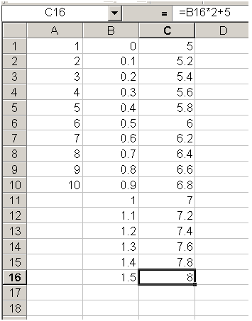
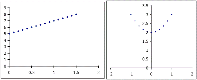
The series in column C is the equation for the straight line y = 2 x + 5 for x = 0 1.5. This will become more apparent in the next section. However, we will first try one more equation.
The $ -sign tells Excel that when copying the equation into other cells, it should always use the value in A2 and not change it based on the cell referencing. This is useful for defining constants. You can also use the $-modifier once only, such as $A2. This means that only the column remains constant (in this case, always column A), and only the rows change as the equation is copied. This series represents the parabola y = x 2 + 2 for x = -1 1.
A useful way to view and present your data is with charts. There are many types of charts available using Excel, but the most useful for calibration curves is the X-Y scatter plot. We will use this tool to plot the straight line y = 2 x + 5 and the parabola y = x 2 + 2.
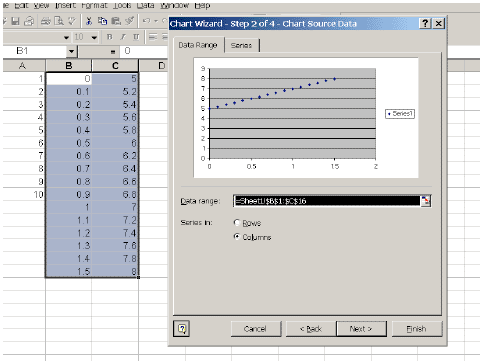
Your plots should look like this:
Proper graph format is essential when you are reporting your results.
Proper formatting of charts and graphs is essential, as they are one of the main ways that information is conveyed in analytical chemistry. It is essential that as much information is presented as clearly as possible on the graph, so that viewer can get the information she requires as quickly as possible.
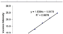
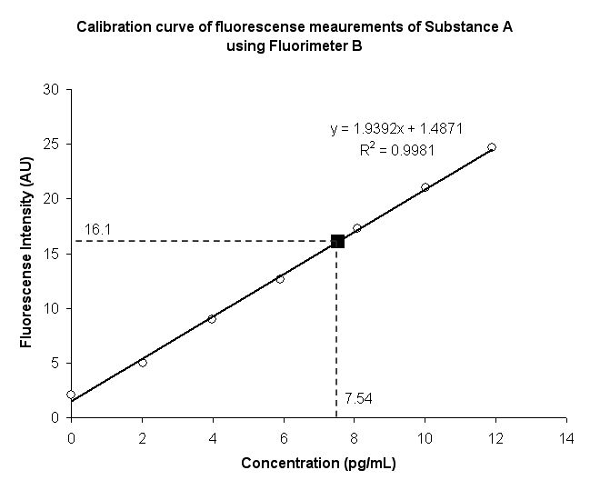
Below is the correctly labeled plot of a calibration curve of fluorescence data at various concentrations. You can also print the graph with all the item descriptions for easy reference.
Important Notes - READ THIS
In this section, we consider two very useful Excel functions that you will use to develop calibration curves. Excel functions are built-in formulas that perform frequent operations. The two functions we will review here are SUM and AVERAGE . Functions can be entered in cells as part of an equation, which begins with an " = " sign.
You will enter fluorescence intensities and use this data to generate a calibration curve related concentrations in pg·ml -1 to the intensities. This data will then be used in all the subsequent examples. Enter the following data in the second two columns of an Excel spreadsheet. Column B should contain the fluorescence intensities and column C the concentrations.
Fluorescence |
Concentration |
2.1 |
0 |
5.0 |
2 |
9.0 |
4 |
12.6 |
6 |
17.3 |
8 |
21.0 |
10 |
24.7 |
12 |
The SUM function in Excel is used to add all the elements in a series of data. This is fundamental for statistical analysis, since all applications involve the sum of a series of numbers or samples. Its use is straightforward when operating on a series of data, such as the fluorescence intensities in the previous exercise. Using this data as a starting point, we will see how the SUM function works.
Throughout this tutorial, whenever you see the symbol S in a formula, it indicates summation over a series of samples or data.
The AVERAGE function, which calculates the mean of a set of samples, is also very useful in statistical analysis. A full definition of the arithmetic mean of a set of data is quite complicated and involved. A simple definition is that the mean is the expected result of any process. It is important to not confuse the population mean with the sample mean. The sample mean is the mean for a set of discrete samples n , given by the formula (S x i )/ n , where the x i are all the discrete samples. The average of a set is denoted by the symbol xbar, so any formula containing this indicates the use of the AVERAGE function.
The population mean is the expected value for a process as n approaches infinity. For instance, if we take a very large number of samples (normally on the order of 10 6 or even higher), we might approach the population mean. It is the true expected value, and is normally denoted µ, and the sample mean is an approximation it. However, the population is not used extensively in this tutorial and is only presented here as to make you aware of the difference.
The AVERAGE function is used in the same way in Excel as the SUM function, except the word sum is replaced with average. To calculate the average fluorescence intensity, the cell where you wish to do this should look like =average(A2:A9) . The calculated value should be 13.1.
Most of the data that you will deal with in this course can be described using a straight line. This is especially true for calibration curves. Excel has a feature that allows you to easily display a linear trendline of a best-fit line through your data. This feature also allows you to view the equation of the best-fit line, and the correlation coefficient, both of which are determined using linear regression analysis. The trendline feature is helpful to quickly test the linearity of your data. A more complete treatment of linear regression is left for a later section.
A calibration curve is an equation that permits us to calculate a desired experimental result in terms of another. In the simplest form, this is given as the equation for a straight line, where the x -value is the input and the y -value is the output. This is a best-fit curve through a series of experimental sample data, and is the series of all points that are average { x , y } pairs of data, for the range of x and y . Once we know the equation for the average line, we can determine how well it fits the actual experimental data, using the product-moment correlation coefficient, or, for simplicity, the correlation coefficient, R . This is a measure of how close the data points are to the line. If the correlation coefficient is ±1, it is a perfect fit and the line accurately describes the data. An R of 0 indicates no linear correlation, and the straight line does not describe the data at all. An | R | value close to 1 is desirable. The sign of R indicates the slope of the regression line. The square of the correlation coefficient, R 2 , is also a common measure.
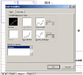
The simplest way to determine a calibration curve from plotted data in Excel is to use the Trendline option on a chart. From this you can view the best-fit curve line and display the equation and correlation coefficient. While this does not provide accurate information, it is a good first test of the correlation. To display a trendline on a plot on the fluorescence:
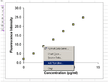
You can display the equation of the trendline and the correlation coefficient R 2 on your plot. Once you have added the trendline,
If you followed the steps correctly, the correlation coefficient and equation should appear on the graph, as in the image below.