Detecting and monitoring
geographical changes in crime rates
Recently, a lot of efforts have been given to the study of
detecting “hot spots” or geographic clusters around location points, termed as
spatial point pattern analysis. Most of them rely upon methods examining
observation retrospectively, that is, in a sense statistical tests are
used to determine the likelihood of the null hypothesis of no spatial clusters
around point locations. This type of approach is widely adopted in spatial
analysis of point data, including crime analysis. For instance, a very common
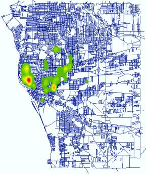
practice in crime cluster detection is using Kernel Density Estimation to
generate point density maps. The following maps are the distribution of three
types of crime events in
|
|
|
|
Arson (Point
Location) |
Arson (Point Density) |
|
|
|
|
|
|
|
Burglary (Point
Location) |
Burglary (Point
Density) |
|
|
|
|
|
|
|
Drug (Point Location) |
Drug (Point
Density) |


As we all know, an important element of effective law enforcement
and community policing efforts is the quick identification of emergent
“hot spots” of increasing criminal activity. Similarly, it’s of interest to
identify areas of declining activity in a timely manner, to aid in the
development of appropriate and effective responses. Thus, a major objective of
this project is to develop statistical methods and monitoring models for the
quick detection of emerging and declining geographic clusters of criminal
activity. Therefore, it is very important to develop methods for the quick
identification of the change of geographic patterns of criminal activity. Retrospective
methods are not quite useful for this purpose and new methods are in need.
Farrington and Beale (1998) provide a summary of the motivation for prospective,
opposed to retrospective, detection of disease outbreaks. The same
argument applies to this study.
1.
Statistical Model
(1) Nearest neighbor statistic
The
nearest neighbor statistic is commonly used in spatial pattern analysis because
of its simplicity. It compares the observed mean of the distance between
points and their nearest neighbors with the expected distance between
them in a random distribution (Clark and Evans, 1954). Therefore, the nearest statistic, R,
is the ratio of the observed to the expected distance:
![]() (1)
(1)
where ![]() is the observed
distance and
is the observed
distance and ![]() is the observed distance. R ranges from 0 to 2.149.
Values less than 1 indicate clustering while 0 means all the points is at a
single location and 2.149 means that points are maximally disperse in space. We
can standardize quantity for a statistical test, z-score, given by:
is the observed distance. R ranges from 0 to 2.149.
Values less than 1 indicate clustering while 0 means all the points is at a
single location and 2.149 means that points are maximally disperse in space. We
can standardize quantity for a statistical test, z-score, given by:
![]() (2)
(2)
where ![]() is the standard deviation of the mean distance in a random
distribution. Under CRS, z has approximately a standard normal distribution. An
observed z-score that is less than the critical value of z would
lead to the rejection of the null hypothesis, favoring the existence of
significant clustering.
is the standard deviation of the mean distance in a random
distribution. Under CRS, z has approximately a standard normal distribution. An
observed z-score that is less than the critical value of z would
lead to the rejection of the null hypothesis, favoring the existence of
significant clustering.
(2)
Cumulative sum analysis
Cumulative
sum analysis is commonly used in industrial process control to monitor product
quality (Wetherill and Brown). It relies on the
assumption that the quantity monitored must be a variable with normal
distribution. Therefore, z-score can be used here without losing
generality. The cumulative sum, following observation t, is given by:
![]() (3)
(3)
where k is a parameter to be defined and often chosen to be 1/2.
Therefore, those z values that exceed h are cumulated. A change in mean is singled where ![]() is larger than a
critical value, h. High values of h will lead to a low probability of a
false alarm but a lower probability of detecting a real change. So h is
determined by the case how large the rate of false alarm is accepted.
is larger than a
critical value, h. High values of h will lead to a low probability of a
false alarm but a lower probability of detecting a real change. So h is
determined by the case how large the rate of false alarm is accepted.
(3)
A cumulative sum approach for the nearest neighbor statistic
At each
stage when a new event is observed (from time t-1 to t), we
random generate a point within the study area, and the distance from it to its nearest
neighbor is calculated. This should be repeated for a large number of times,
therefore the mean (d) and variance (![]() ) of the distances from the randomly generated points to their
nearest neighbors can be found. We should be able to get z-score from
equation (1). Following the equation (3), to detect departures from randomness
in the direction of clusters, one would use:
) of the distances from the randomly generated points to their
nearest neighbors can be found. We should be able to get z-score from
equation (1). Following the equation (3), to detect departures from randomness
in the direction of clusters, one would use:
![]() (4)
(4)
A
single of change in pattern will be sound when ![]() >h. Because distances to nearest neighbors can not
meet the requirement of a normal distribution posted by cusum
approach, we need to aggregate successive, normalized observations into batches
by summing the z-scores within a batch. Batch size, b, is another
parameter. Normally, the value of b can be quite small.
>h. Because distances to nearest neighbors can not
meet the requirement of a normal distribution posted by cusum
approach, we need to aggregate successive, normalized observations into batches
by summing the z-scores within a batch. Batch size, b, is another
parameter. Normally, the value of b can be quite small.
This approach has been proven to be very effective, resulting in
quick detection of deviations from expected pattern. Please see the paper by Rogerson (1997) and the paper by Rogerson
and Sun (2000) for detailed discussion. As suggested by them, other statistical
measures can be used in conjunction of cumulative sum analysis as well.
2. Integration
GIS have been proven
very useful for spatial analysis due to its capabilities of managing large
geographic database and providing visualization techniques. However in
real-world practice, how to integrate them is of great question to many domain
analysts. Hopefully the potentials brought by the recent advance of the
so-called “Object-Oriented” paradigm in computer science can be demonstrated
hereunder.

(1) Integration
strategy
One of the objectives of
this project is to develop a stand-alone package as an interface between the
statistical models and end-users. This piece of software should be able to work
without specific GIS software installed and must have the basic map operations,
like zoom in, zoom out, pan etc. To develop it, there are basic two major
strategies:
- Strongly coupled strategy: in this
strategy, there are two sub-types. In the first one, analysis and modeling
tools are coded as modules within GIS, therefore extending the functionality
of the system. This strategy can also be called ‘GIS
include models’ approach. The other is called ‘Models include GIS’, in which
some GIS basic operations are included in Statistical models.

·
Loosely coupled strategy: in
this strategy, tools are independent of a GIS and they exchange data via files.
This strategy is also known as ‘models are connected to GIS’.

This software must be a seamless
and integrated package and can later be distributed for end-users. Besides,
only some basic GIS operations are needed. As we know, most GIS operations are
very complicated and time consuming. Somehow, at certain time we just need some
of them. Thus the combination of ‘Models
include GIS’ and ‘Models are connected to GIS’
is more appropriate here. Thanks to the advancement of computer
technology. The emergence of Object-Orientated programming and modeling
approach makes this possible.
·
Component Object Model (COM): this is more flexible
strategy. GIS operations are coded as individual piece. The user has a choice
to choose which GIS operations to include.
Therefore, I chose ESRI MapObjects
2 as GIS
components, Visual Basic as programming language, and Gauss as modeling
language. The integration is sort of based on the combination of COM and ‘Model are connected to GIS’. Gauss is an advanced language based on matrix operations. It’s
very fast when it comes to statistical and matrix calculation.
(2) GIS interface
The interface looks like the
below figure. The Legend, the left part of the main
interface, controls the order of the map layers and the user can turn on/off
specific layers by checking/un-checking the respective checkboxes. Inside the Map View, the blue dots represent all
the observations (events) of 1996 arsons reported by Police Department of
Buffalo City, ![]() , the
user can change the properties of the active/current layer and carry out
thematic mapping on that layer.
, the
user can change the properties of the active/current layer and carry out
thematic mapping on that layer.
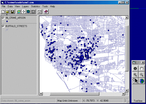
Figure-1: Interface and Toolbox
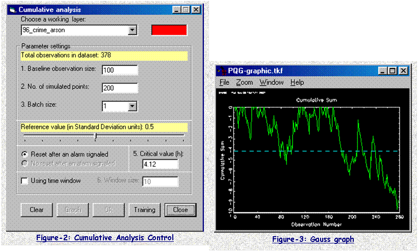
One of the major tasks
of this package is to implement Cumulative
Analysis Module. Figure-2 is the input
window of this function. The user can set the certain parameters, which are
then used to generate Gauss programs. Gauss programs finish most of the
statistical and matrix calculation, and final results are saved in files
specified by the user. Gauss programs also create a trend graph (Figure-3),
which show those potential events that might cause the occurrence of
clustering.
The results saved from Gauss
programs then can be used for further interactive analysis (Figure-4). The chart
shown in left is the same graph in Figure-3, and it shows the trend how the
cumulative sum changes while new observation added. Obviously, an alarm
(potentially the sum will be above the red slash line, but actually it’s set
back to 0) is sound when an observation is added and the cumulative sum is over
a critical value. The right table is the total list of those observations and
those causing alarm are labeled as you can see.
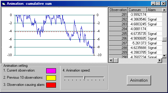
Figure-4: Animation Control
By Linking the Map
View, Table, and Chart, we can easily look at
the location of the observation in the Map View. When the user selects
any point in either Map View, Table or Chart, the
respective point in Map View, Table or Chart will
be highlighted as well (Figure-5).
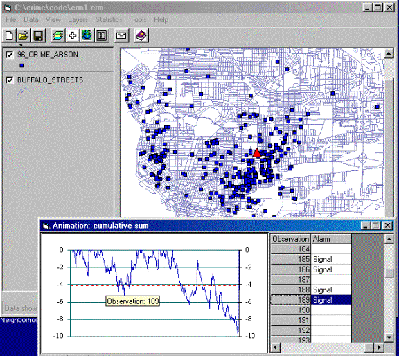
Figure-5: Linking Map View, Chart and Table
To better understand
this, an Animation function is
implemented in addition to this. The below is a snapshot during an animation
run. The yellow circles are the latest 10 observations (events) just before the
current observation (event) which is represented as pine triangle here, and the
red triangles are the events causing an alarm when the cumulative sum passing a
predefined critical value which is set as 4.12 standard deviation unit in this
test run.
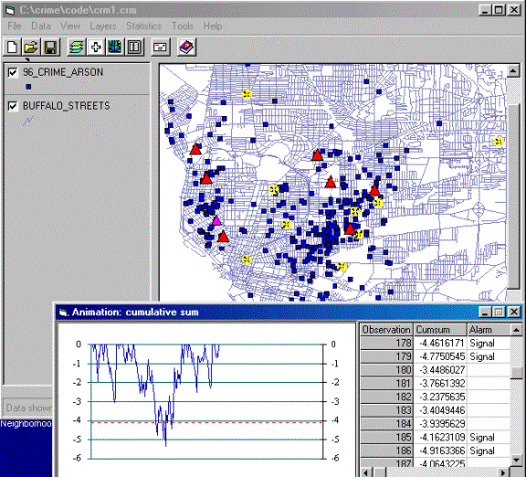
Figure-6: Snapshot of Animation